Goal Line as Visual Anchor
The horizontal goal line on every chart serves as an instant reference — users can assess their day without reading a single number. Bars above the line feel rewarding; bars below provide context without judgment.
Helping new mothers rebuild healthy habits through guided goal-setting, multi-dimensional tracking, and personalized coaching — across iPhone and iPad.
The postpartum period is one of the most physically and emotionally demanding transitions a person can experience. New mothers are simultaneously recovering from childbirth, adapting to round-the-clock infant care, and trying to re-establish healthy routines — often with little sleep and limited support.
I was brought on to design the user experience for a health tracking app that needed to balance two competing demands: providing rich, actionable health data for users and their coaches, while keeping the interface simple enough that a sleep-deprived new parent could use it one-handed during a feeding session.
How do you present complex, multi-layered health data in a way that feels encouraging rather than overwhelming — especially for users who are already under significant physical and emotional strain?
I began by reviewing existing health and fitness tracking apps to understand conventions users were already familiar with, and where those conventions fell short for this specific audience. Most mainstream fitness apps assume a user who is motivated, goal-driven, and has a predictable daily routine — assumptions that break down during the postpartum period.
Through conversations with the product team and subject matter experts in postpartum health, I identified several key insights that shaped the design direction:
Progress needs to feel gentle, not punitive. Missed days and imperfect numbers are inevitable with a newborn. The app's visual language needed to celebrate progress without highlighting failure.
Context matters more than raw numbers. A calorie count alone is meaningless without the context of goals, averages, and trends. Users and coaches needed to see the bigger picture at a glance.
Tracking fatigue is the biggest threat to retention. If logging feels like homework, users will abandon the app within weeks. Every interaction needed to be fast, forgiving, and optional.
Weekly coaching content needs to feel timely. Generic health tips would be ignored. Content needed to acknowledge the specific stage of postpartum recovery the user was in.
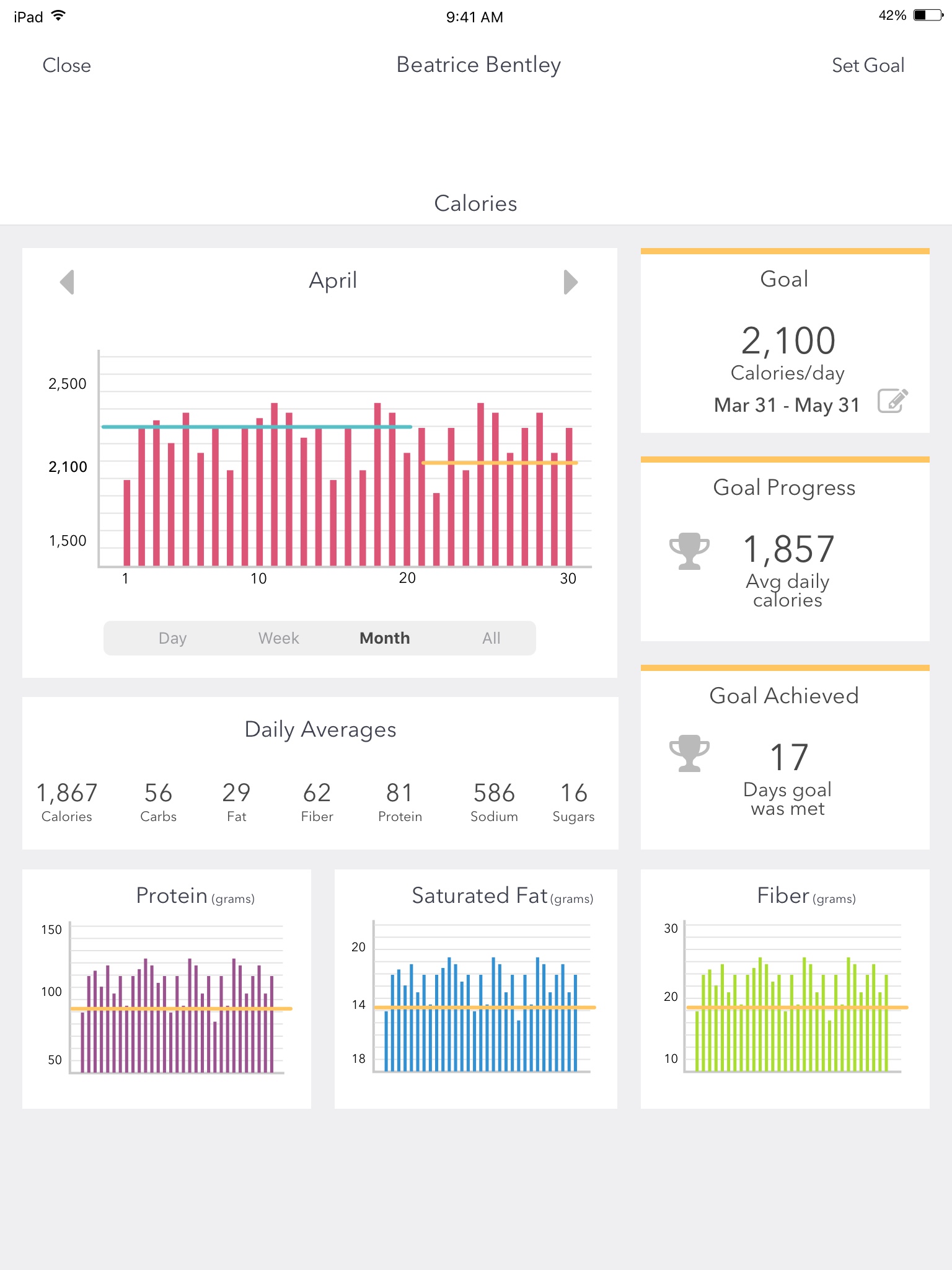
The heart of the app is the Progress screen — a calorie and nutrition tracking dashboard that adapts its data density based on the selected time range. I designed four distinct views (Day, Week, Month, and All) that share a consistent layout structure but adjust the level of detail to match the scope of data being shown.
Each view presents a bar chart of daily calorie intake with the user's goal rendered as a horizontal reference line, making it imcase-studiestely clear which days fell above or below target. To the right of the chart (on iPad) or below it (on iPhone), a summary panel shows the active goal, average daily calories, and the number of days the goal was met.
Below the main calorie view, secondary charts for protein, saturated fat, and fiber provide deeper nutritional context. Each uses the same bar-and-reference-line pattern for visual consistency, with a color system — purple for protein, blue for saturated fat, green for fiber — that creates instant visual differentiation.
On iPad, the progress dashboard uses a two-column layout: the bar chart occupies the left column while goal summaries stack vertically on the right. On iPhone, the same information reflows into a single column with the chart on top and metrics below. The macro charts shift from a three-column row (iPad) to a stacked vertical sequence (iPhone), ensuring data density on tablet without sacrificing readability on phone.
I designed the Day/Week/Month/All toggle as a segmented control anchored directly below the chart, keeping the time-range context tightly coupled with the data it controls. Arrow navigation on either side of the date header lets users step forward and backward through time periods without changing the selected granularity — so browsing through weeks or months feels fluid rather than requiring mode switches.
This pattern was particularly important because coaches needed to review a participant's data at different scales during check-ins: the daily view to understand specific meals, the weekly view to spot behavioral patterns, and the all-time view to assess overall trajectory.
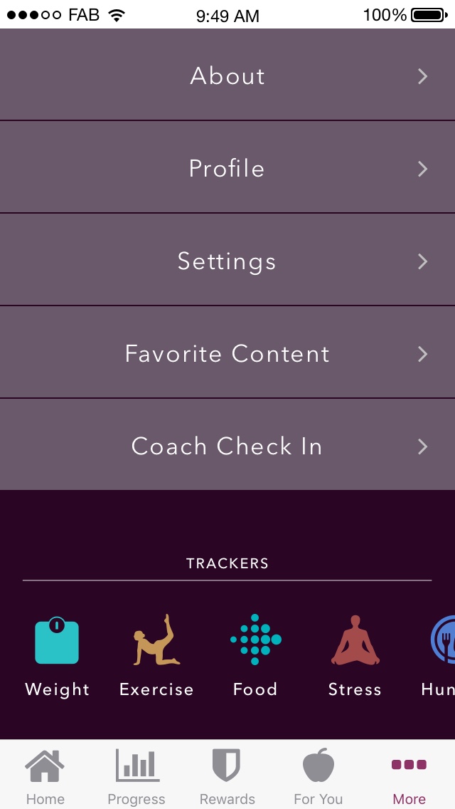
Beyond calorie tracking, the app supports five additional tracking dimensions: weight, exercise, food, stress, and hunger. I consolidated access to all trackers in the "More" screen, using a horizontally scrollable icon row that gives each tracker a distinct visual identity.
Each tracker opens a purpose-built logging experience. The exercise tracker, for example, presents a minimal form with just four fields — date, exercise type, duration, and distance — with large, easy-to-read typography and two equally weighted action buttons at the bottom. A new mother logging a 30-minute walk can do so in under ten seconds.
The "For You" section delivers stage-appropriate coaching content tied to the user's week in the program. Each piece opens with an empathetic, relatable hook — acknowledging the reality of postpartum fatigue before offering practical, achievable advice.
The weekly goal is presented with large, prominent typography so users can internalize the number at a glance. Below the goal, a brief note about earning rewards ties into the app's broader engagement system without making gamification feel forced.
The weigh-in flow follows a similar philosophy: a supportive, non-judgmental introduction that normalizes the process, followed by a single call-to-action to log the week's weight. The tone is warm and practical — acknowledging that not everyone has a scale at home and suggesting alternatives.
The horizontal goal line on every chart serves as an instant reference — users can assess their day without reading a single number. Bars above the line feel rewarding; bars below provide context without judgment.
Trophy icons alongside "Goal Progress" and "Goal Achieved" create a sense of accomplishment. "17 days goal was met" reframes imperfect adherence as progress rather than failure.
Displaying daily averages helps users understand overall patterns rather than fixating on individual days — a deliberate choice to encourage sustainable behavior change.
Warm purples and teals rather than clinical blues or aggressive reds. The palette feels nurturing and approachable, aligning with the coach-guided tone of the experience.
The app uses a five-tab navigation structure: Home, Progress, Rewards, For You, and More. This architecture separates the daily experience, data review, motivation, coaching content, and account management into distinct mental models — preventing any single screen from trying to do too much.
I chose a bottom tab bar over hamburger navigation because the target audience needs imcase-studieste, one-tap access to core features. A hidden menu would have added friction to every session, and for an app that depends on daily engagement, even a single extra tap can erode usage over time.
Design for the worst moment of the user's day. A postpartum wellness app will be used during night feedings, in the fog of sleep deprivation, and during moments of frustration. Every interaction needed to be achievable under those conditions — large touch targets, minimal required input, and forgiving navigation.
Data density should scale with screen size and intent. The iPad layout could afford side-by-side chart and summary panels because tablet usage tends to be more intentional. The iPhone layout stacked the same information vertically because phone usage is more fragmented and often one-handed.
Encouragement is a design pattern, not just copy. The way data is framed — averages over totals, days achieved over days missed, progress over perfection — communicates emotional tone as powerfully as any written message.
Consistency across views builds learnability. By maintaining the same layout structure across all four time-range views, users only need to learn the dashboard once. The data changes; the mental model stays the same.
Fit After Baby represents a design challenge that goes beyond interface aesthetics: it's about understanding that health technology for new mothers needs to meet a fundamentally different standard of empathy, simplicity, and encouragement than mainstream fitness apps provide. By grounding the design in the real constraints of postpartum life, I created a tracking experience that feels like a helpful companion rather than another obligation.