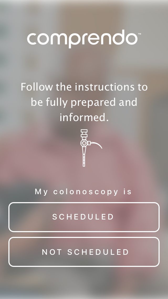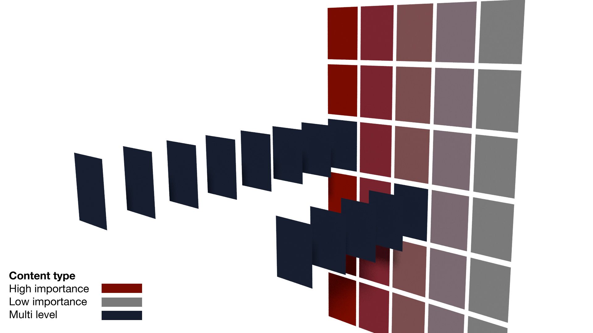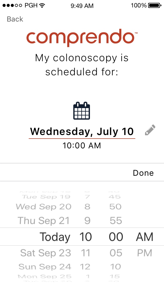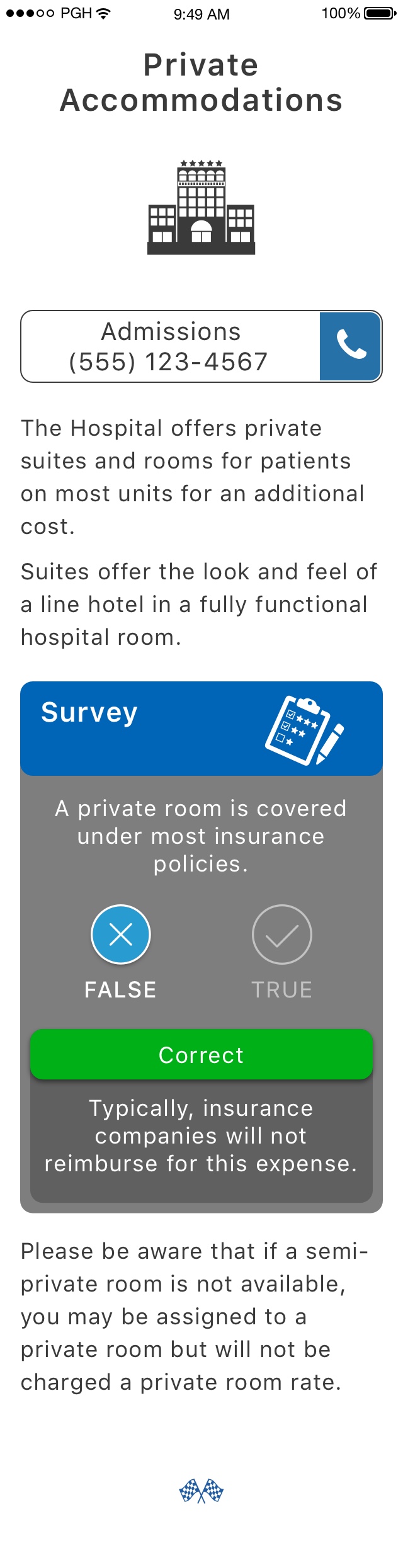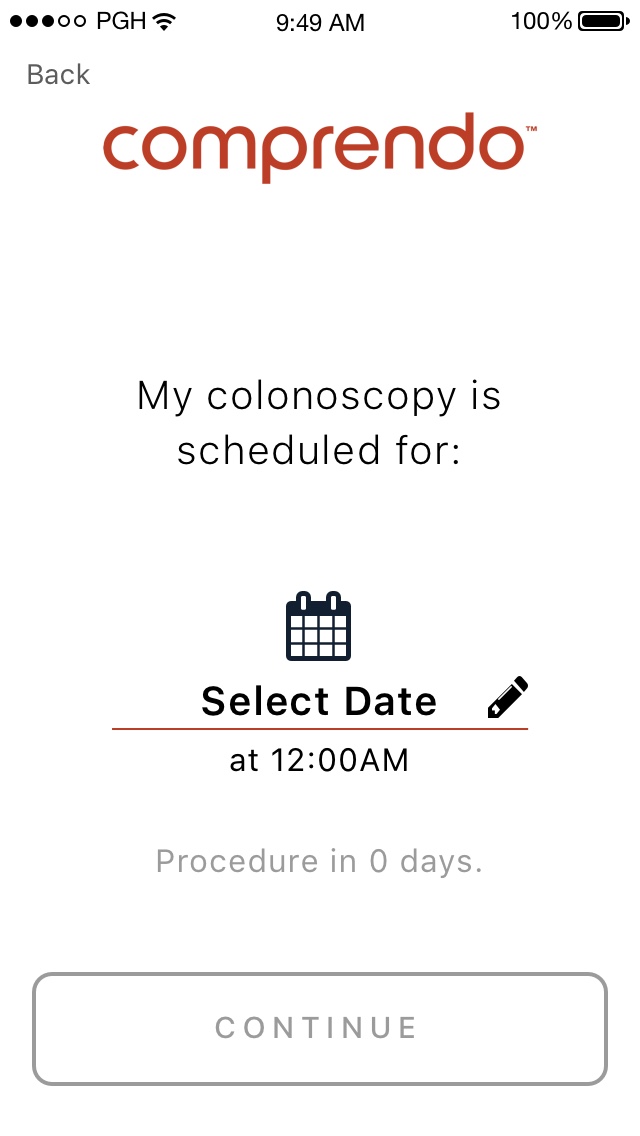
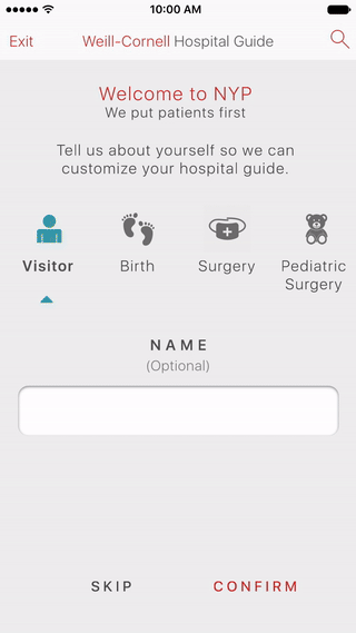
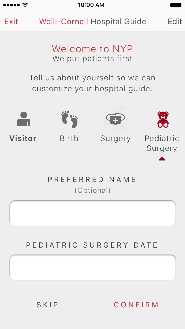
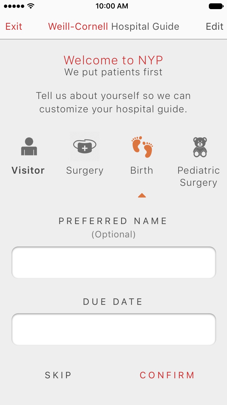
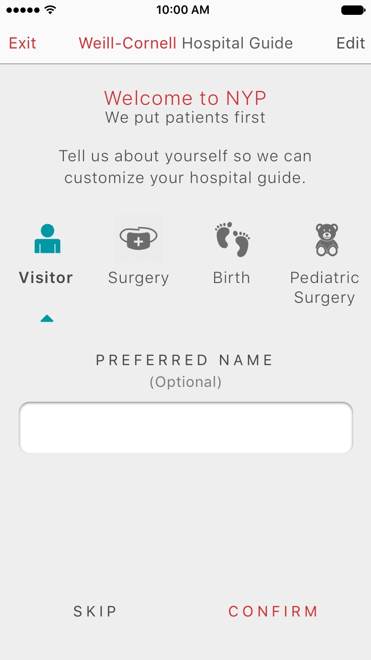
New York Presbyterian Hospital
Problem:
Patients scheduled for surgery—and their visitors—often faced long registration times, excessive paperwork, and a lack of clarity around pre- and post-procedure care. This created stress, reduced engagement, and negatively impacted overall patient outcomes.
Challenge:
The existing onboarding process was fragmented and not optimized for digital engagement. Patients and visitors lacked timely access to relevant information and resources, particularly around surgery preparation, recovery, and maternity care.
Solution:
I led the design of a unified onboarding experience tailored for surgical patients and hospital visitors. The experience delivered timely, personalized touchpoints—before, during, and after hospital visits—through intuitive content and interactive guidance. It also streamlined administrative tasks such as digital registration and paperwork completion.
Outcome:
The new onboarding flow reduced registration time and paperwork burden, while also improving patient preparedness and satisfaction. Early data showed positive impacts on pre- and post-surgery experiences, including better recovery adherence and more informed maternity patients.

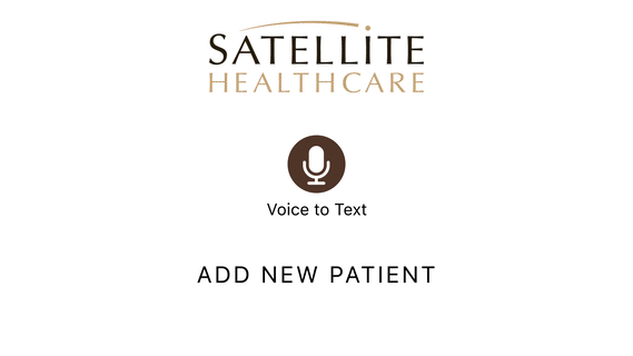
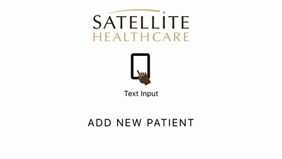
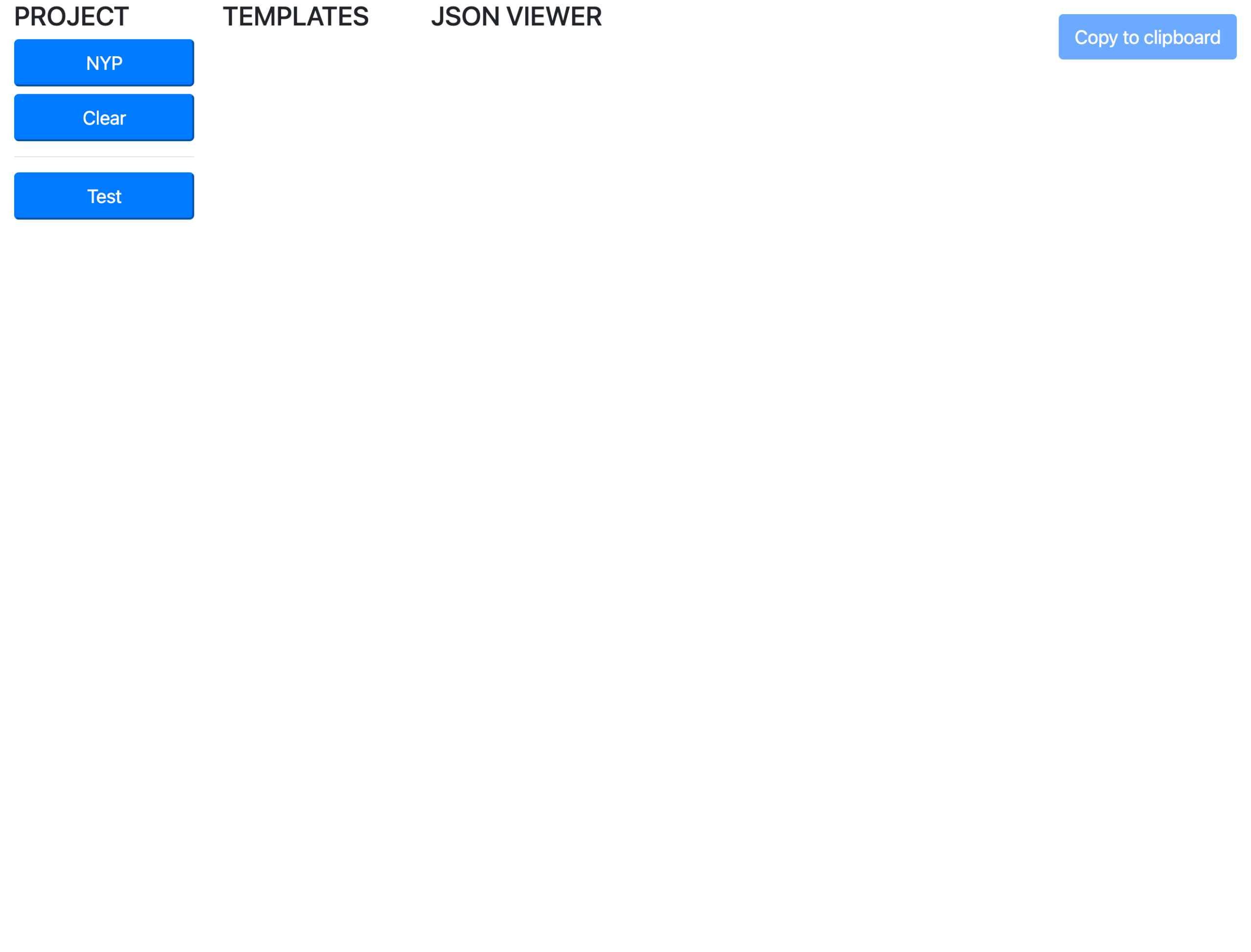
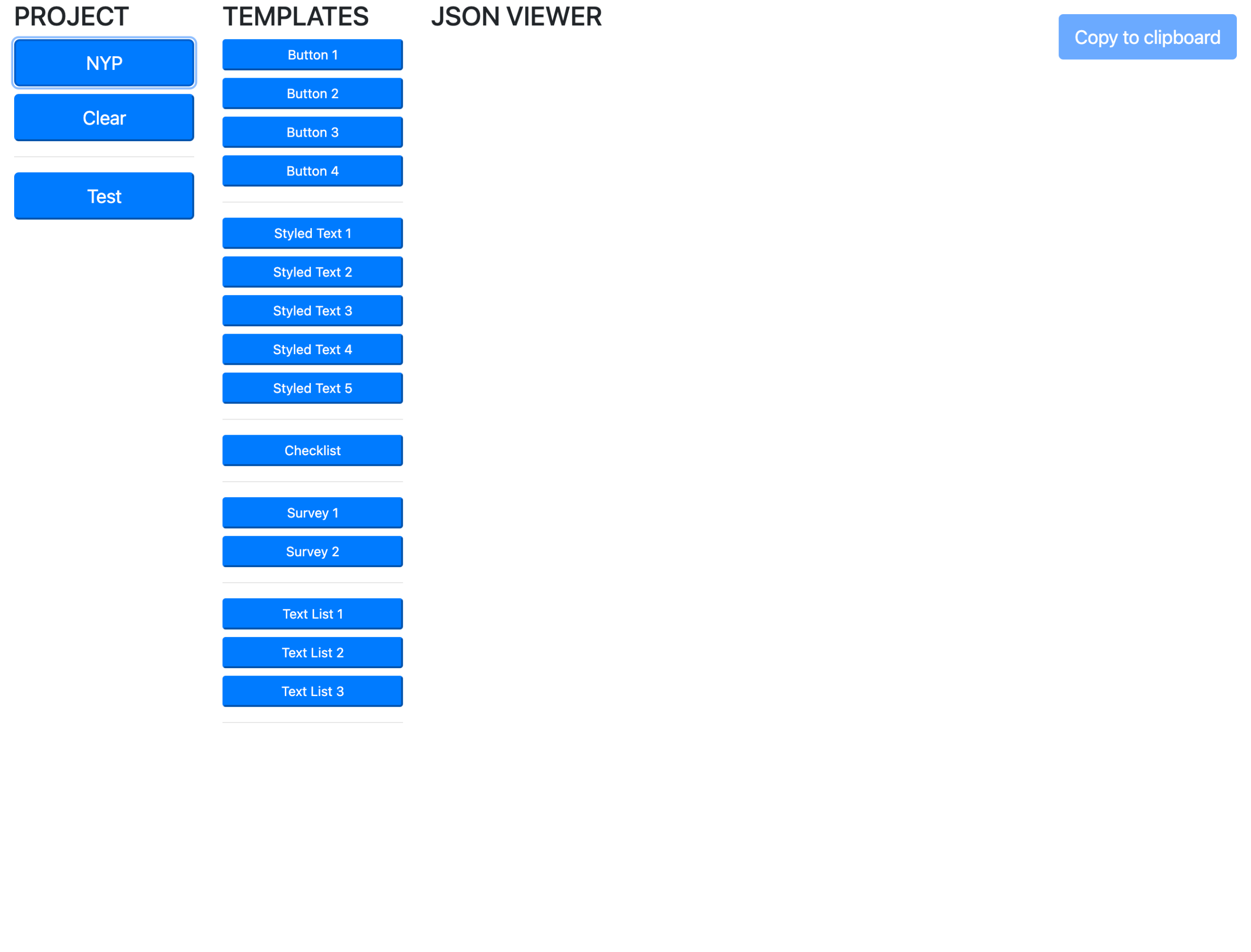
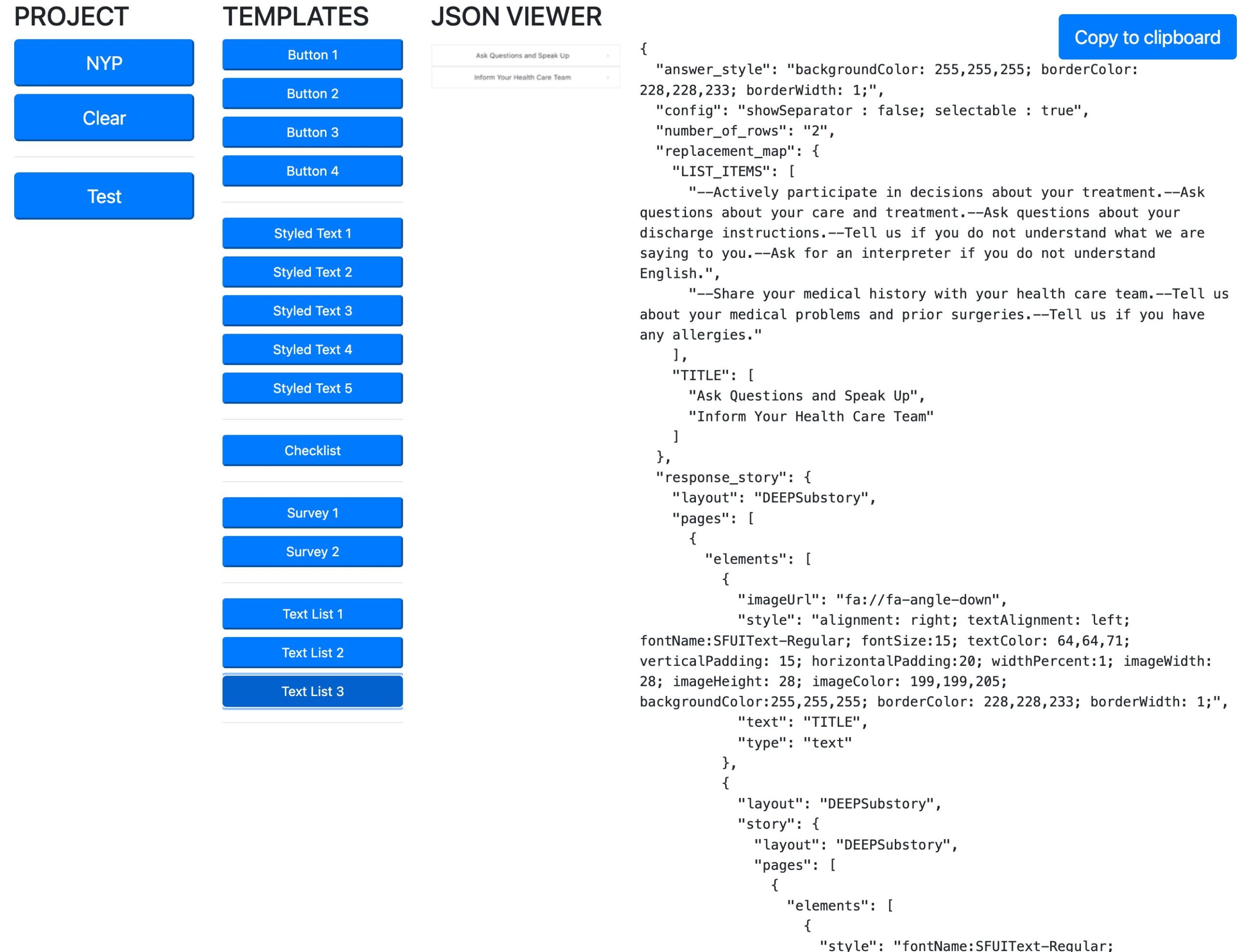
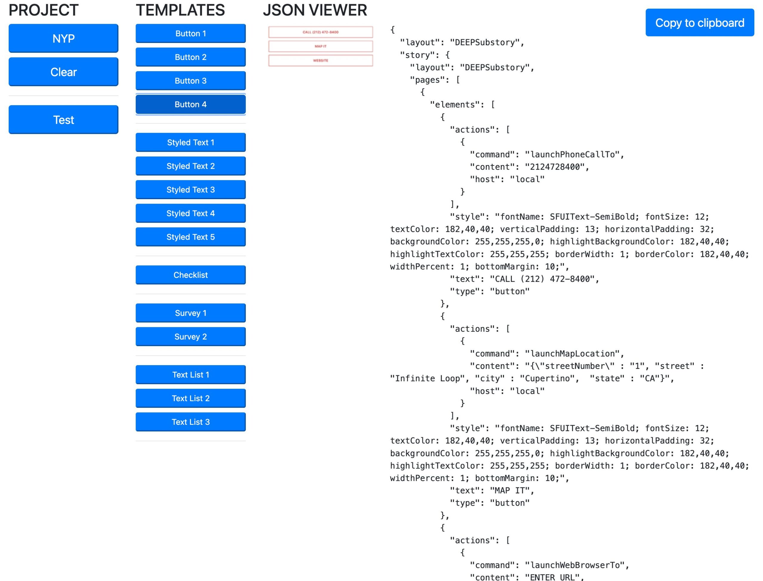
CMS JSON Library
Problem:
Live project
Our content publishing process required teams to manually retrieve and insert JSON snippets to configure CMS modules, content blocks, and UI components. This process was inefficient and often led to publishing delays and formatting errors.
Challenge:
Non-technical users—including content managers and health practitioners—were expected to work directly with raw JSON. This often resulted in incorrect formatting and misuse of components, especially since our proprietary CMS required specific formatting and whitespace handling that standard JSON editors didn’t support.
Solution:
I designed and built the CMS JSON Library, an internal tool that streamlines the process by offering a searchable, graphical interface for browsing, previewing, and copying CMS-ready JSON components in one single button press. In addition to improving usability, I also implemented functionality to automatically convert JSON formatting (including whitespace and special characters) into the specific structure required by our proprietary CMS, eliminating a major source of friction for users.
Outcome:
The tool significantly reduced publishing errors and support requests, improved content deployment speed, and empowered cross-functional teams to work more autonomously. It’s now a core part of our publishing workflow, helping technical and non-technical users alike work more efficiently and accurately.
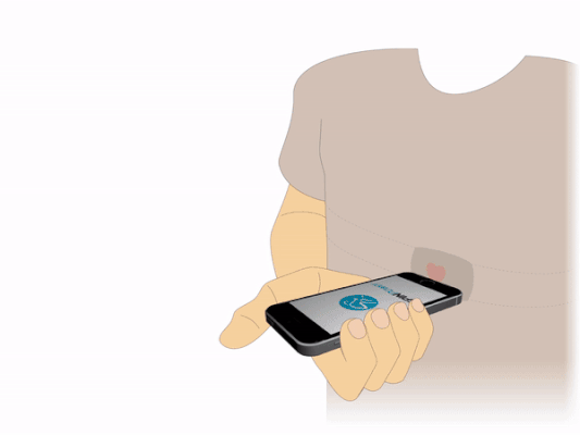
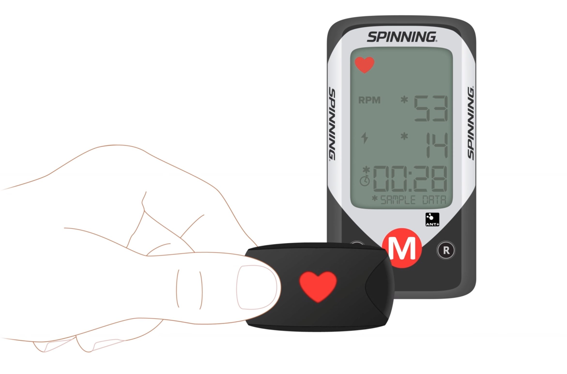
Spinning bike – power sensor acquisition
Problem:
The new power bike relied on a third-party ANT+ bridge sensor to transmit wattage data from the bike computer to mobile devices. However, users struggled to pair the sensor successfully, leading to confusion, inconsistent data readings, and a poor onboarding experience.
Challenge:
The technical process for pairing ANT+ sensors was not intuitive for most users. The steps required to connect and sync power, heart rate, and cadence data were unclear, and the lack of visual feedback created friction, especially for new riders.
Solution:
I led the end-to-end UX design for the sensor pairing experience, creating a fully animated, step-by-step flow that guided users through the process naturally and intuitively. I implemented pixel-perfect motion design and refined typography to clearly communicate each phase of the pairing—from device detection to successful data sync—ensuring that users could connect their sensors with confidence.
Outcome:
The redesigned experience significantly reduced support inquiries related to sensor setup and improved overall customer satisfaction. Users were able to reliably connect their devices and track power, heart rate, and cadence with minimal effort, enhancing the product’s perceived reliability and usability.
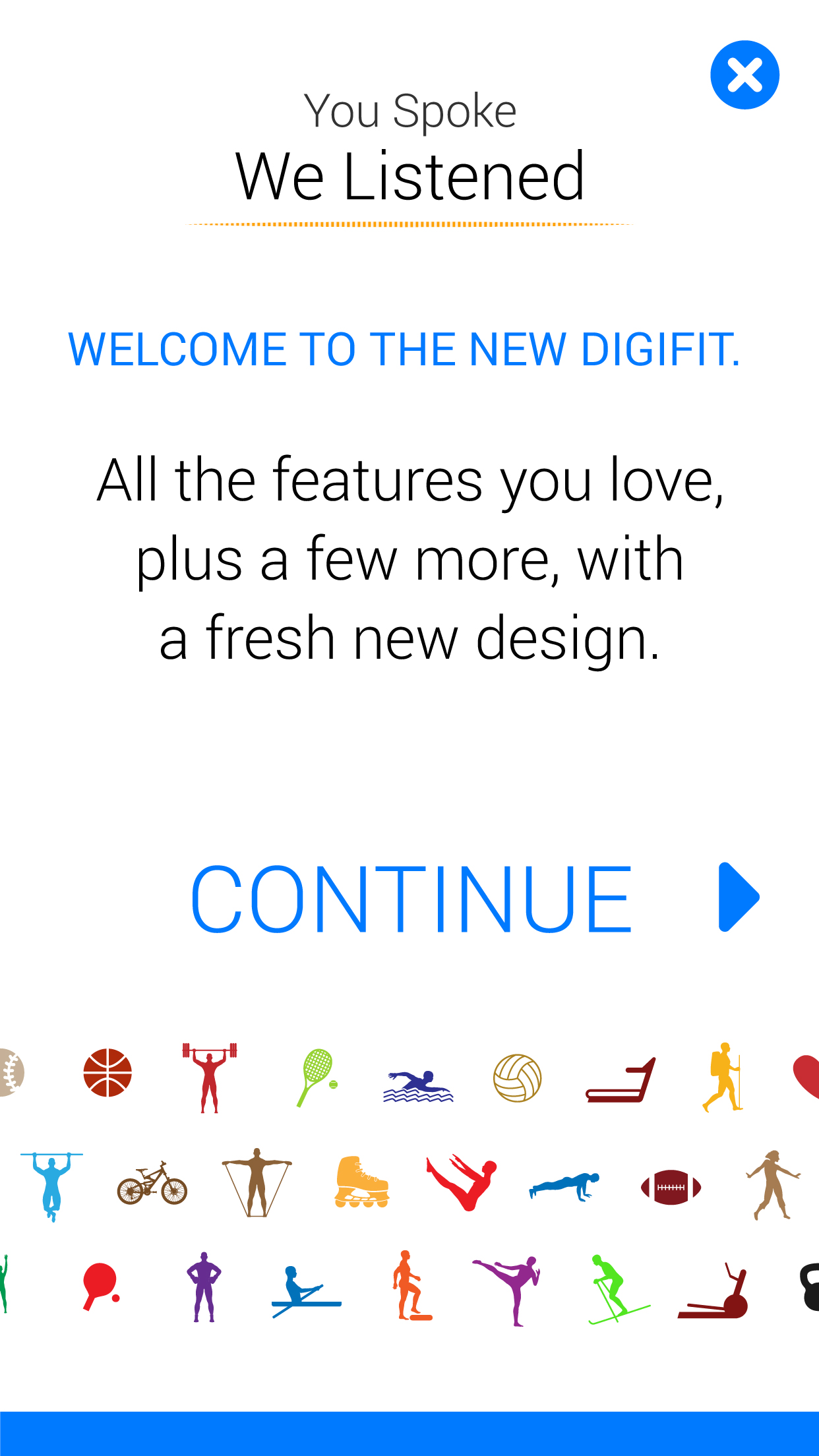
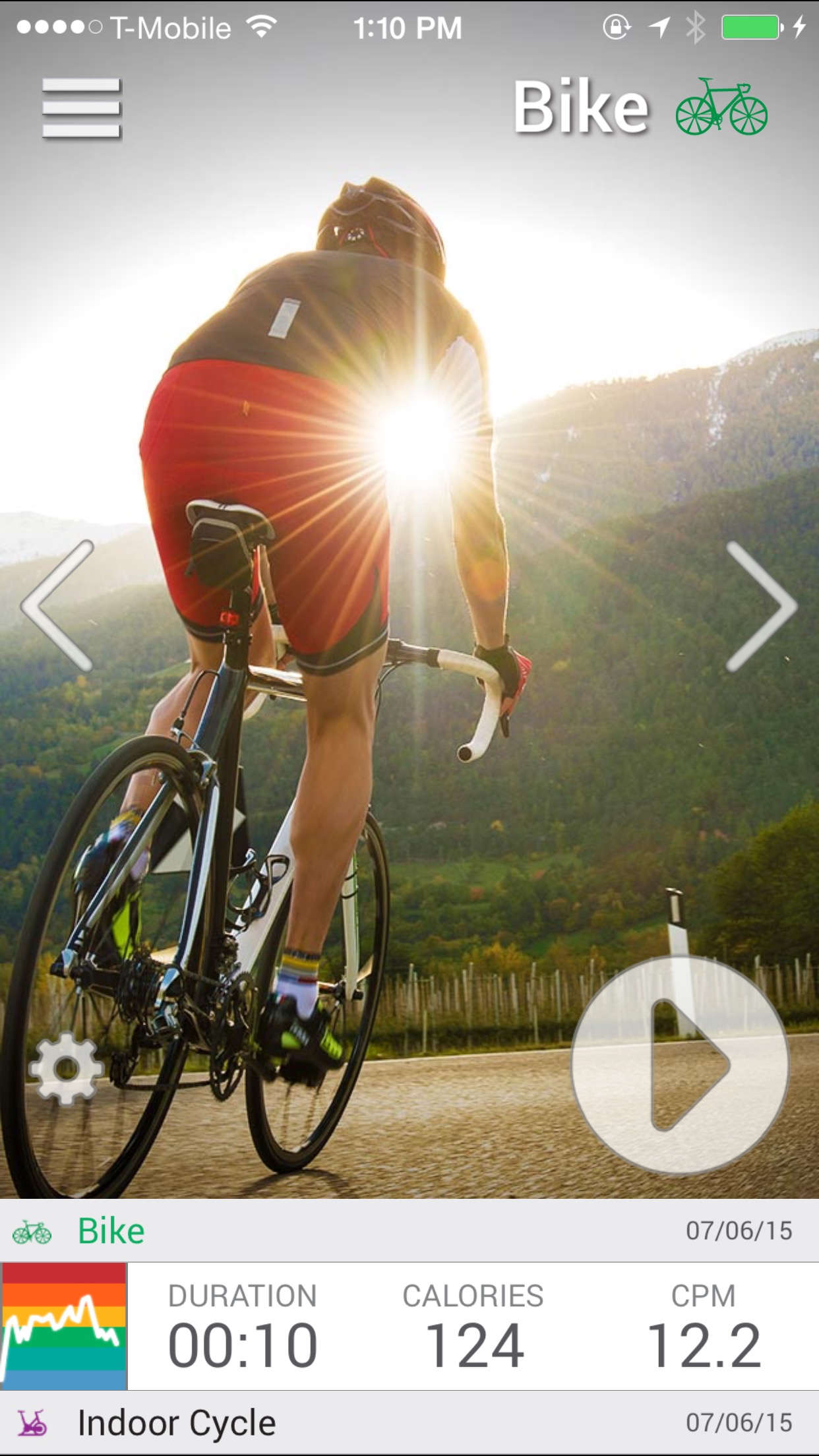
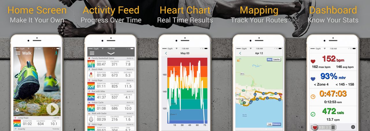
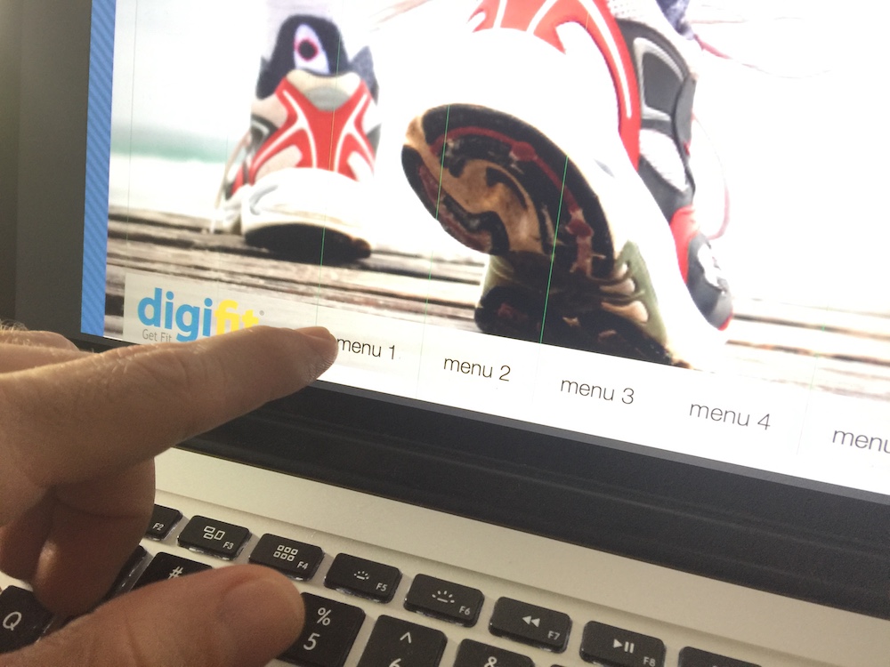
Digifit – Mobile app
Digifit was the first mobile app to pull heart rate data to a mobile device, hence it was imperative to keep that technological edge with every single iteration of the app. I initiated the redesign of the home screen after listening to users feedback. I solved most of their concerns by making the start (Play-like) activity button larger so users could track an activity while already working out. Users reported that after the update they didn’t always need to look at the screen as the button was large enough for them to remember its placement by repetition and not always look at the screen and that the full screen horizontal drag feature made their activity selection a breeze. The activity selector allowed users to perform full screen swiping along with full size photograph to select the activity of their choice. Along with other improvements the redesigned UX gave users a sense of control which made their workouts more pleasurable and removed of technological constrains.


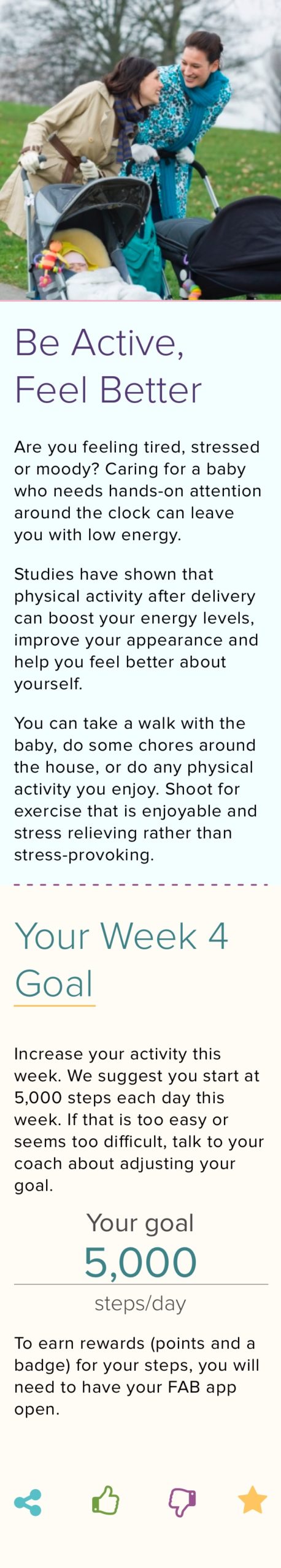
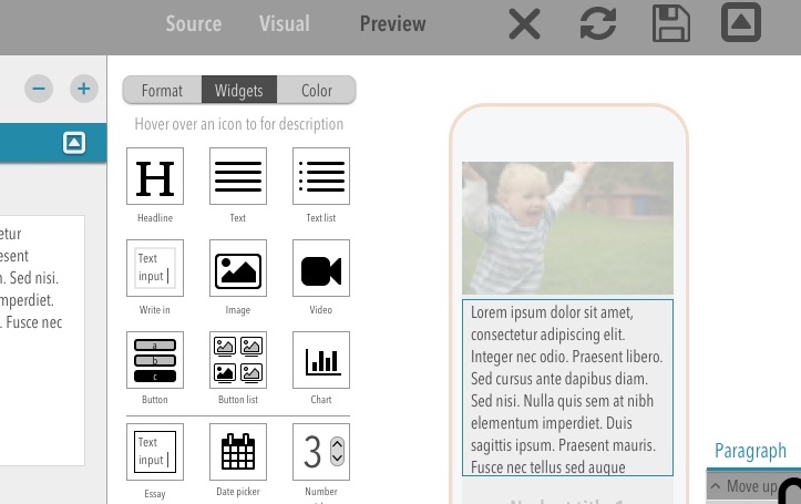
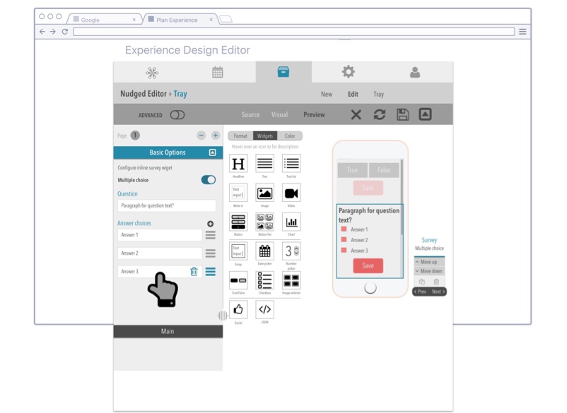
Digifit – Authoring tool for health practitioners (CMS)
Problem:
Doctors and health practitioners often needed to guide patients through complex pre- and post-surgery care routines. However, delivering personalized, condition-specific education at scale was time-consuming and inconsistent.
Challenge:
There was no efficient, user-friendly way for non-technical medical staff to create and publish tailored content for different medical procedures. Many existing tools had steep learning curves or lacked the flexibility to support varied patient journeys.
Solution:
I led the design and development of a custom CMS that enabled health practitioners to create and manage condition-specific content without technical assistance. The interface featured bold, accessible UI elements and a drag-and-drop widget system that made it easy to add surveys, contact forms, educational touchpoints, and follow-up resources. The system was designed to reduce friction and allow practitioners to focus on patient outcomes, not formatting.
Outcome:
The CMS empowered practitioners to deliver personalized care instructions at scale, improving patient preparedness and reducing the burden on clinical staff. The intuitive interface shortened content creation time and led to broader adoption across departments focused on surgical recovery, chronic condition management, and maternity care.

Prototyping Animations, Interactions, and Feedback Mechanisms
Problem:
User engagement within the app was declining over time. While initial usage was strong, retention and daily interactions dropped significantly after the first few weeks.
Challenge:
Behavioral data revealed a disconnect: although users continued working out (as confirmed by API activity logs), they were no longer actively interacting with the app to log or explore activities. This indicated a breakdown in perceived value or motivation to engage with the interface.
Solution:
Through qualitative and quantitative research, we identified that the activity selection and feedback flow felt static and unrewarding. I prototyped a new interaction model that introduced micro-animations, dynamic feedback, and gamified UI patterns. These changes made activity selection more engaging and provided users with immediate, delightful responses that reinforced their behaviors.
Outcome:
The redesigned interaction model increased in-app activity logging and session duration. Users reported a more enjoyable experience and were more likely to return to the app regularly. These improvements contributed to an overall lift in engagement metrics and better alignment between user behavior and product feedback loops.

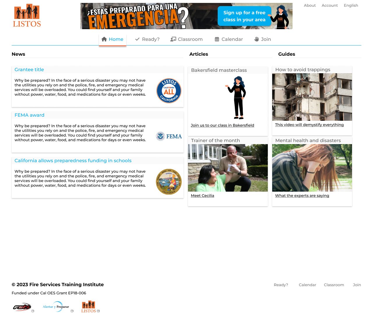
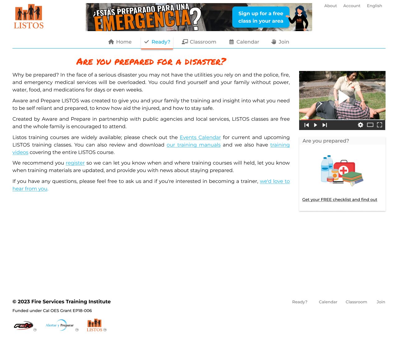
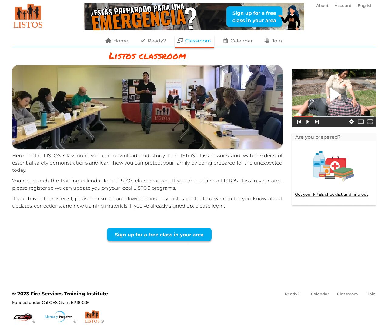
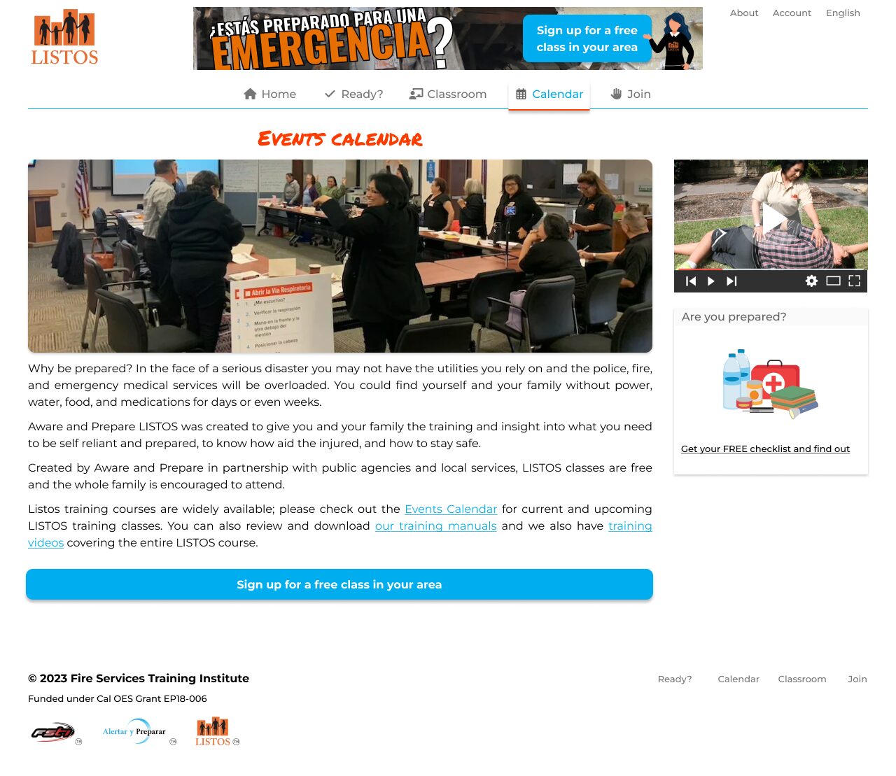
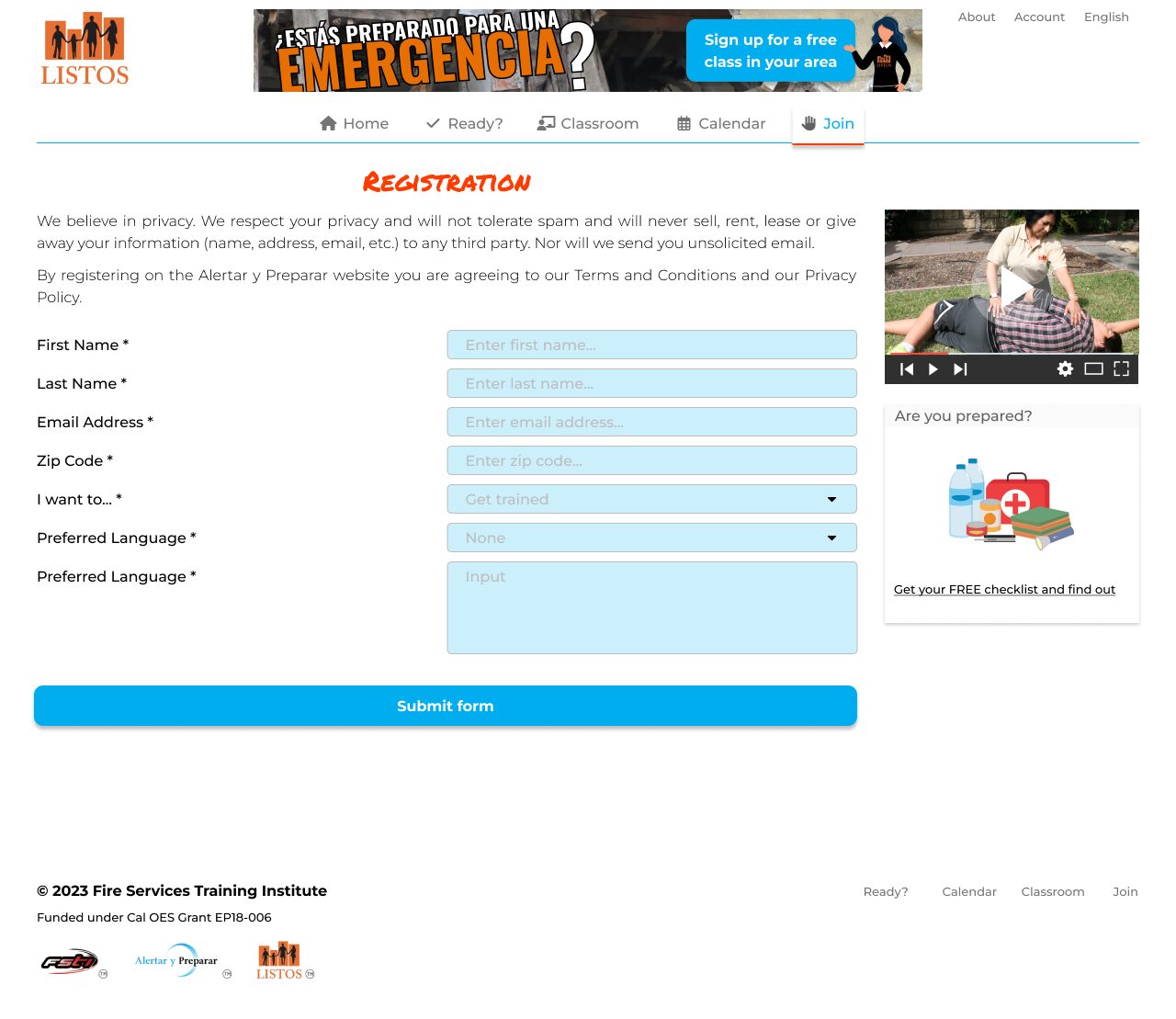
Emergency management
Listos, an emergency management agency based in Santa Barbara, CA, needed a centralized way to handle class registrations along with a cohesive marketing web presence that resembled the posters, manuals and flyers I had been delivering for over a decade. It succeeded helping instructors connect with potential students and class schedules.
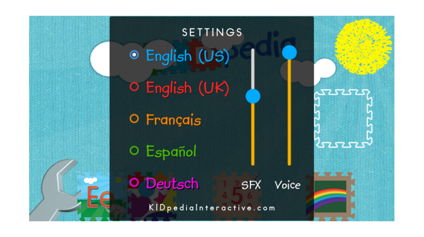
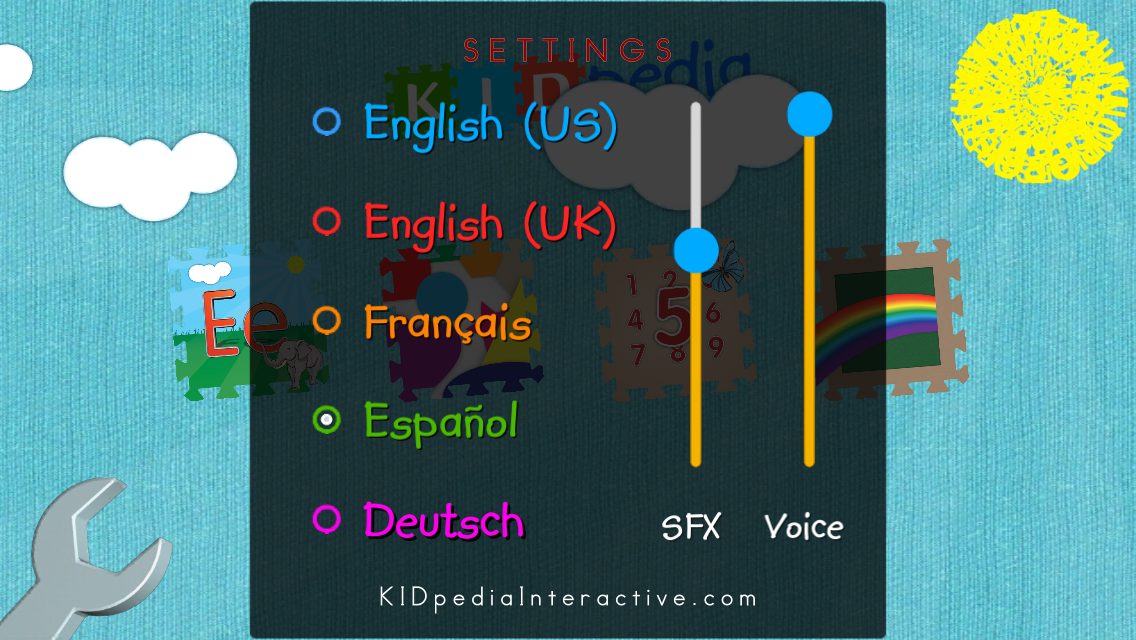
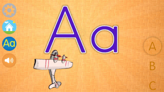
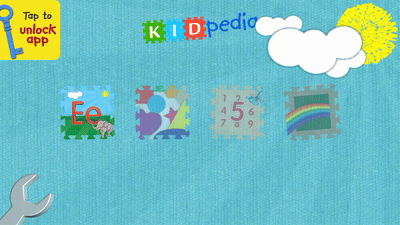
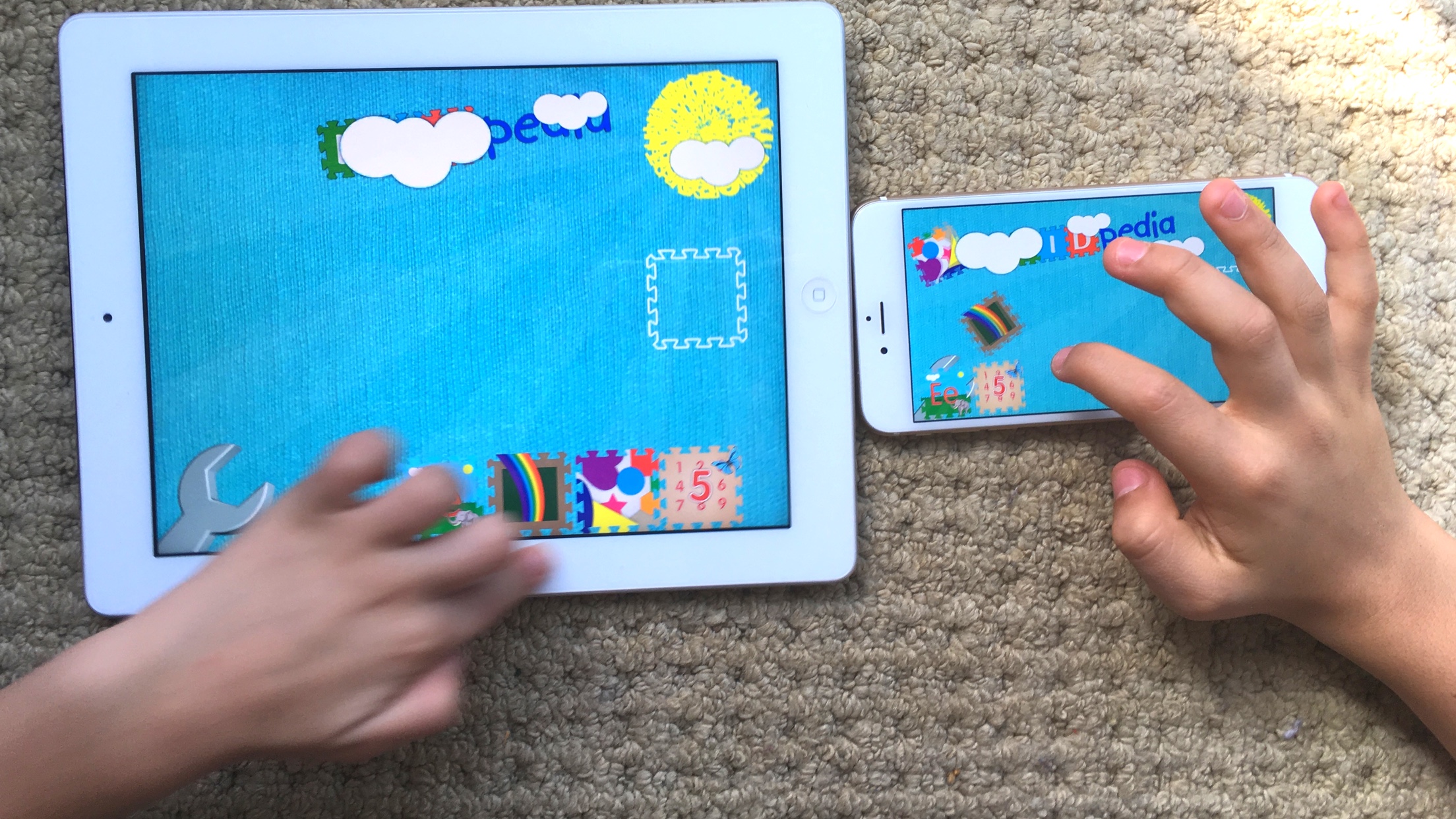
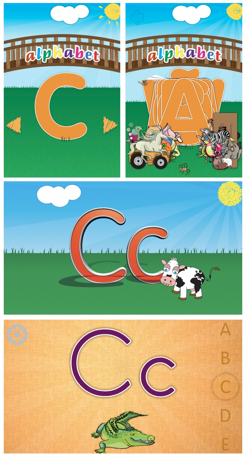
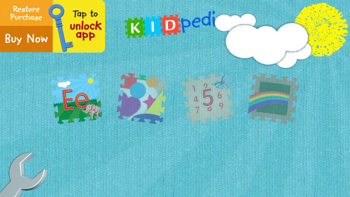
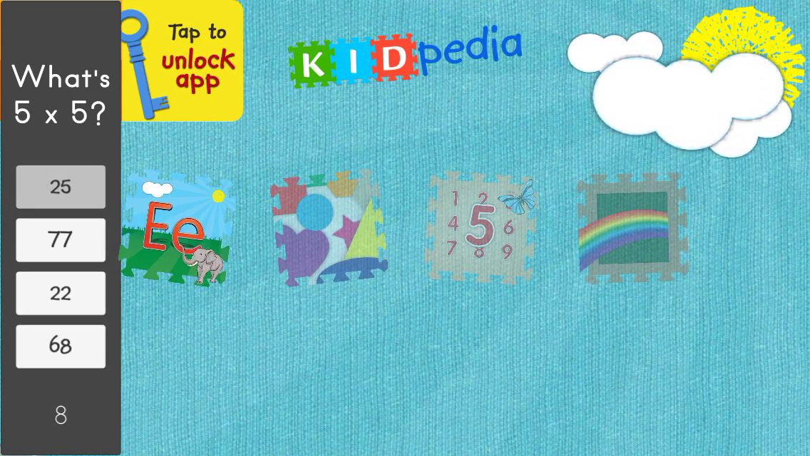
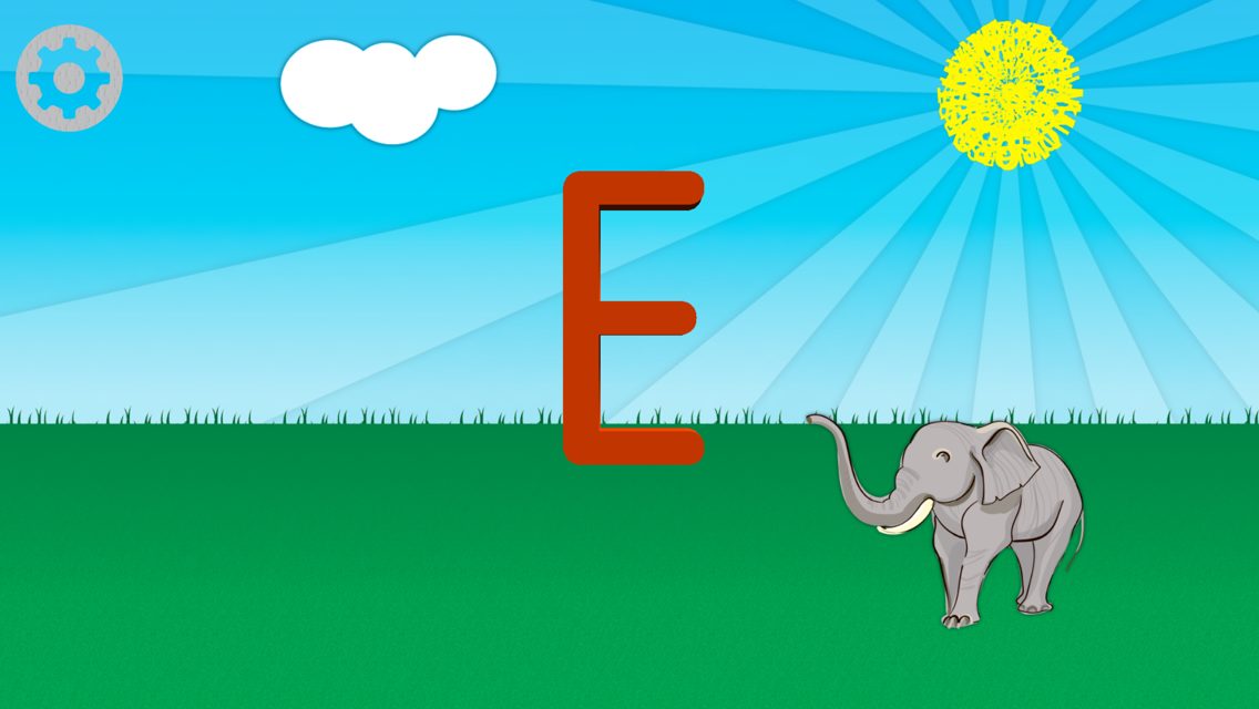
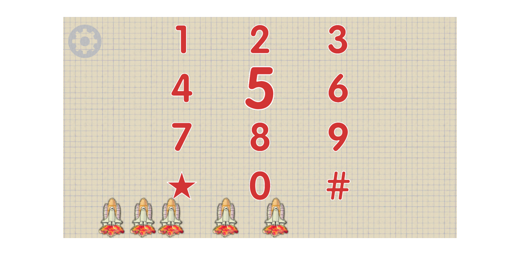
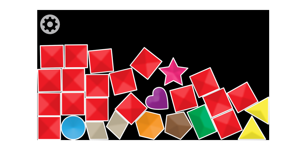
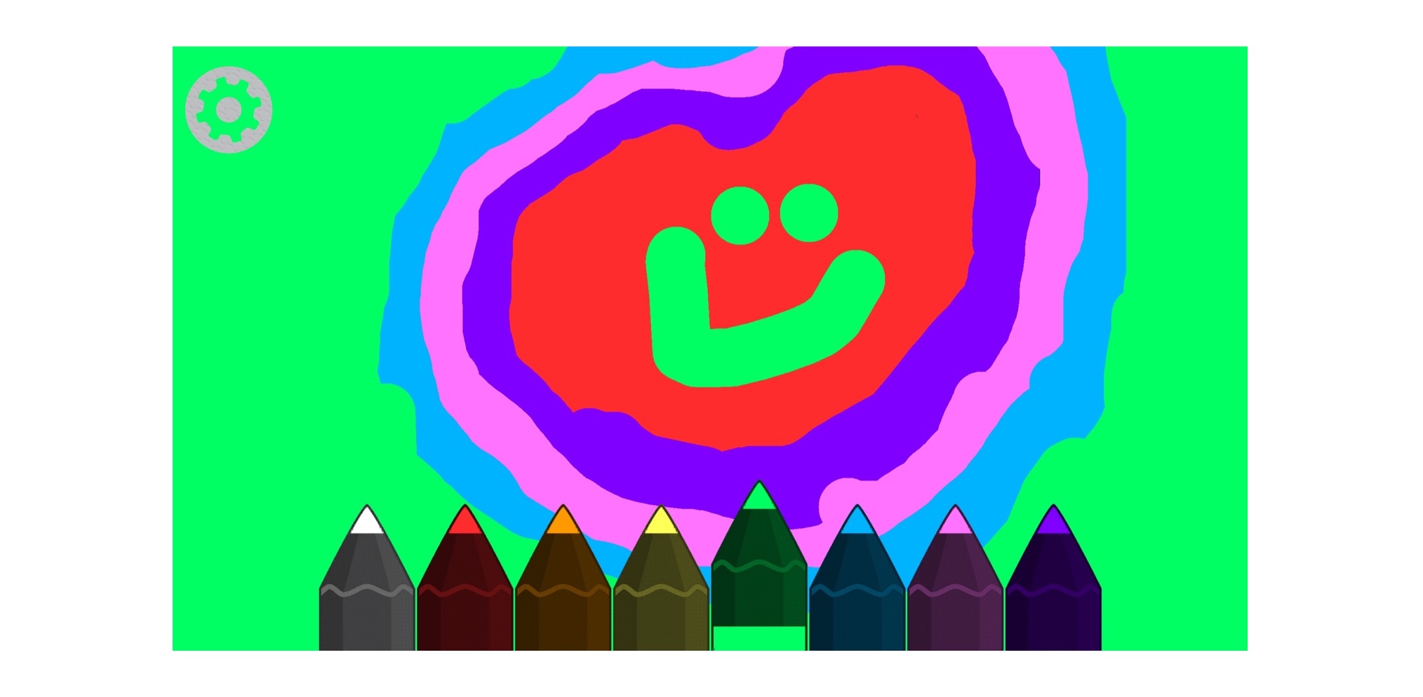
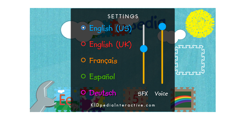
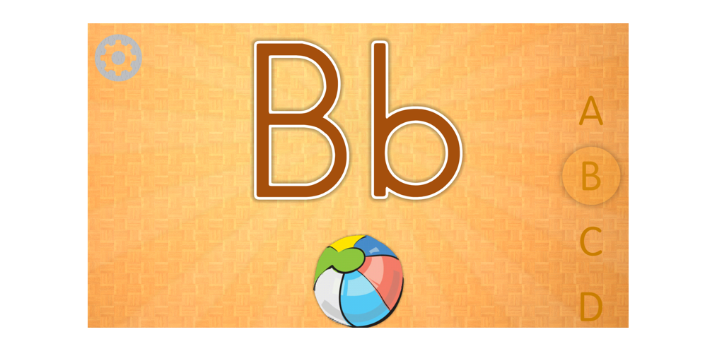
KIDpedia – Educational and interactive app
Designed and coded in C# educational and interactive learning app for young children. The first iteration of the app was developed by a remote team and even though it was a successful launch I sought more interactivity and physics throughout the experience. After taking a pascal class at City College I decided to embark on the redesign of the app in Unity. So far I have 2,000+ users and have more scenes with different content coming along via updates.
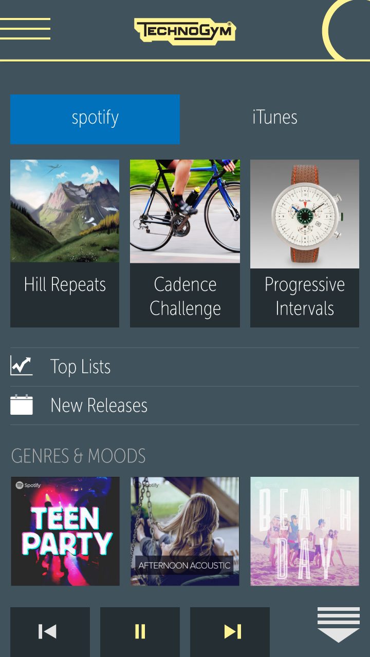
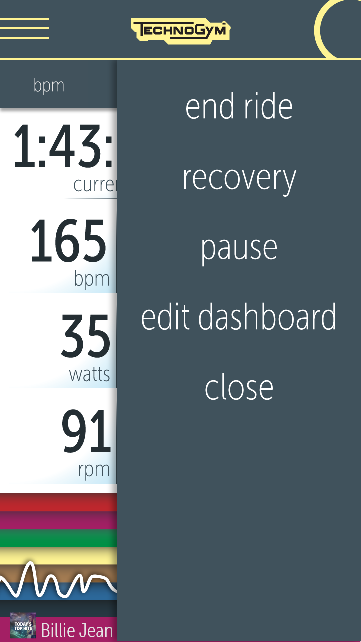
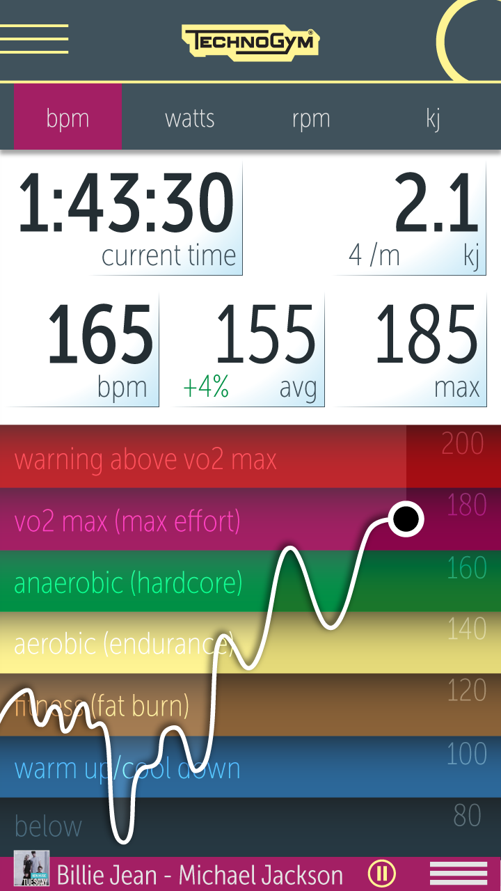
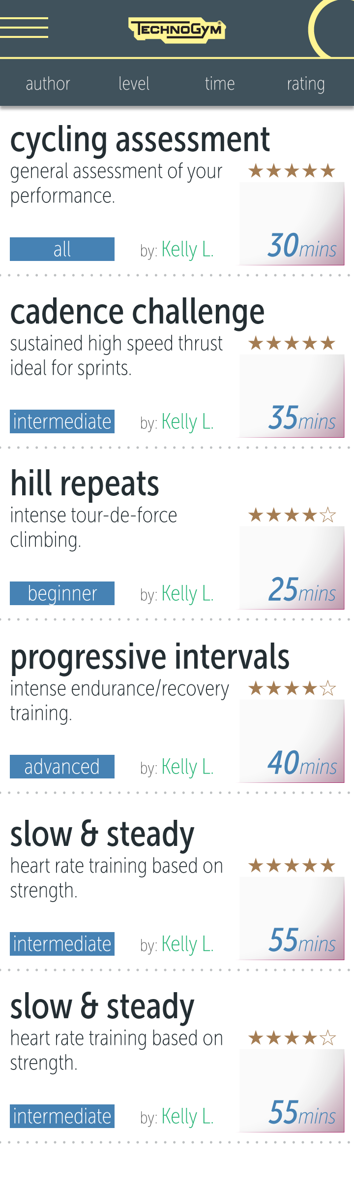
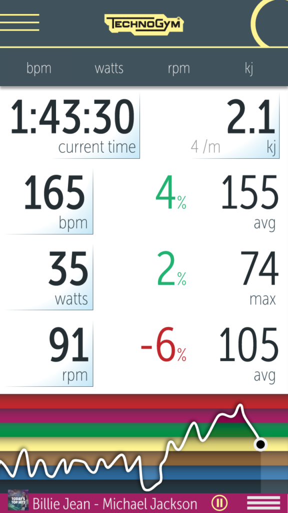
Technogym
Designed mobile prototypes for partnership with Europe’s largest gym equipment manufacturer.


Others